
Indiana Tech Navigation Redesign
The first part of our redesign effort focused on identifying users, addressing their friction when navigating through our site and improving their experience.
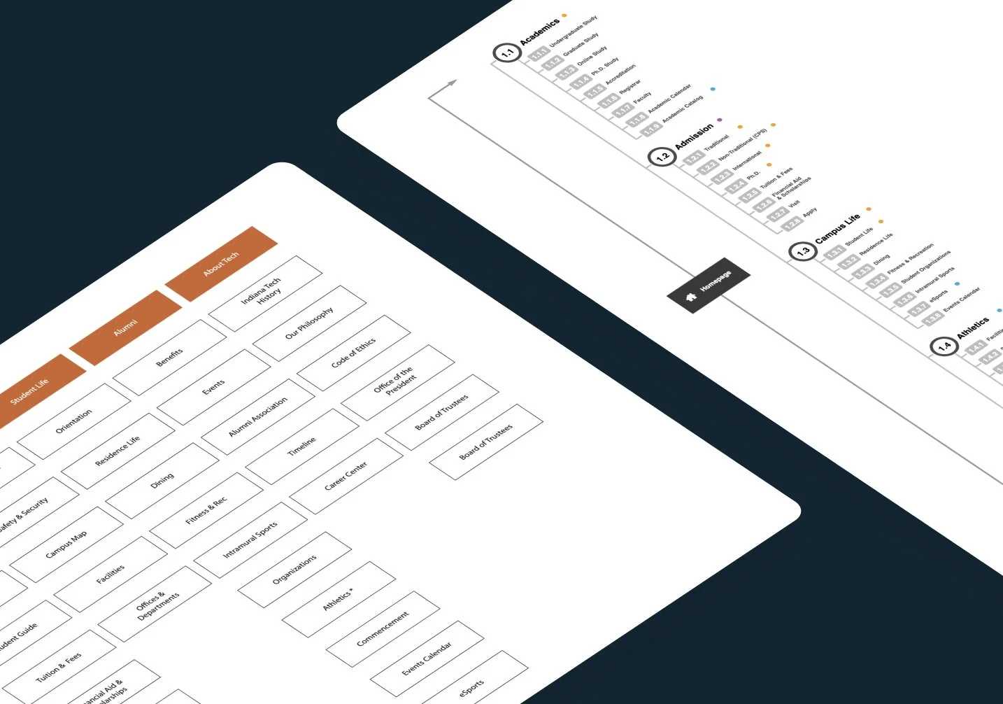
The scope of the website redesign encompassed over 1,500 pages and 30+ micro-sites within the broader Indiana Tech website ecosystem.
Role
UX / UI Designer
Team
1 Designer, 1 Developer
Kickoff
One of the first major tasks was identifying the goals for the redesign. We thoroughly examined user data, feedback, and website analytics.
🎯 Goals
Establish user driven (and specific) navigation patterns
Evaluate existing content then organize based on user needs and expectations and partner with stakeholders to update contentDevelop a content management strategy and assign DRI’s from departments to own their content
Market + product landscape
What are other universities doing and offering? How do their sites compare to Indiana Tech’s website?
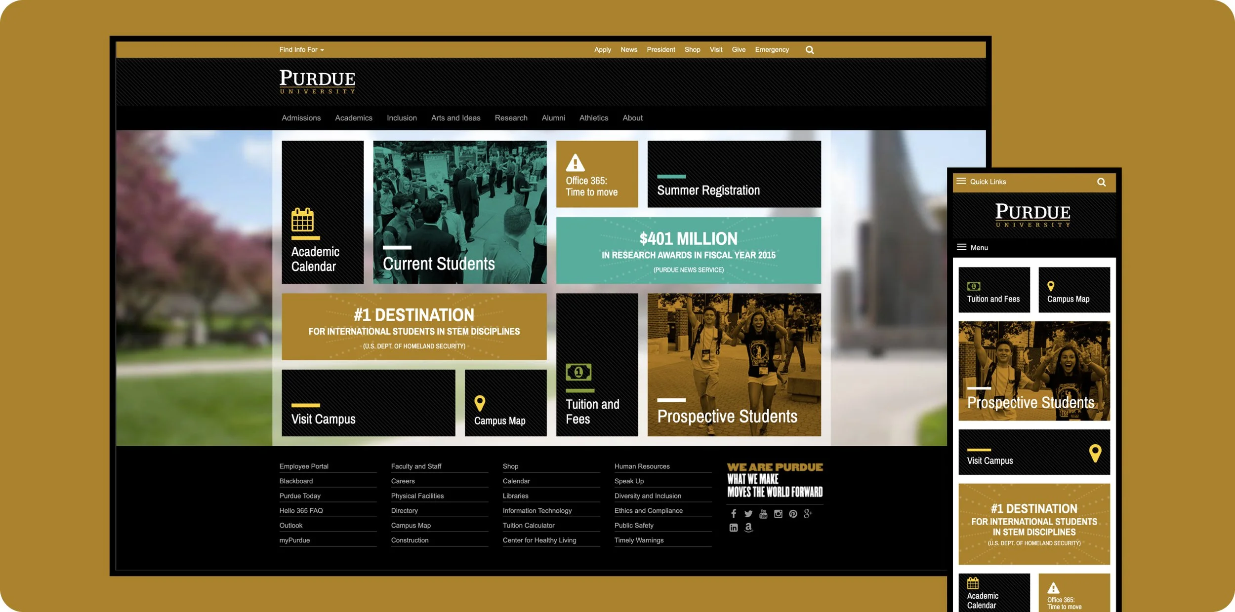
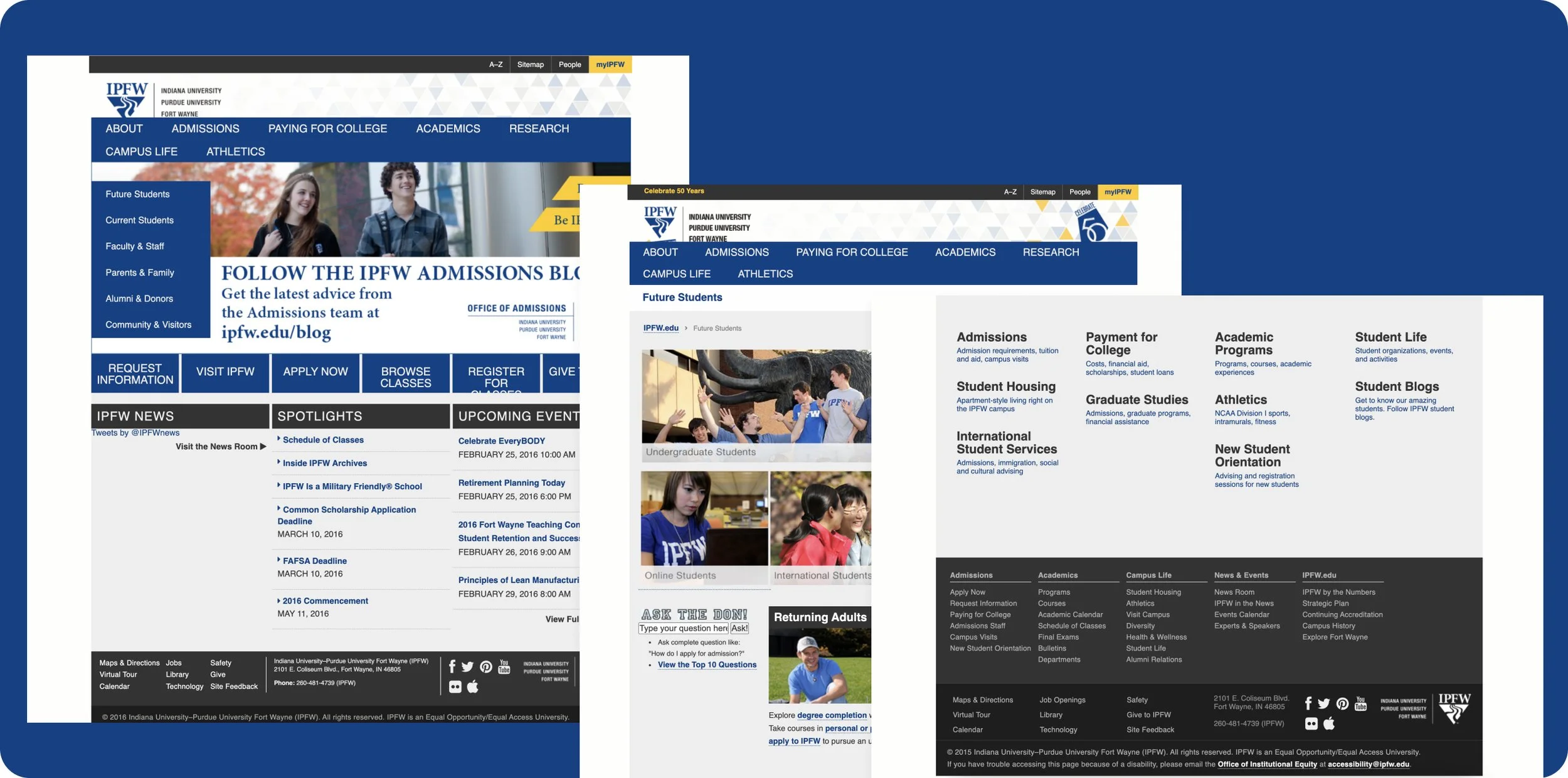
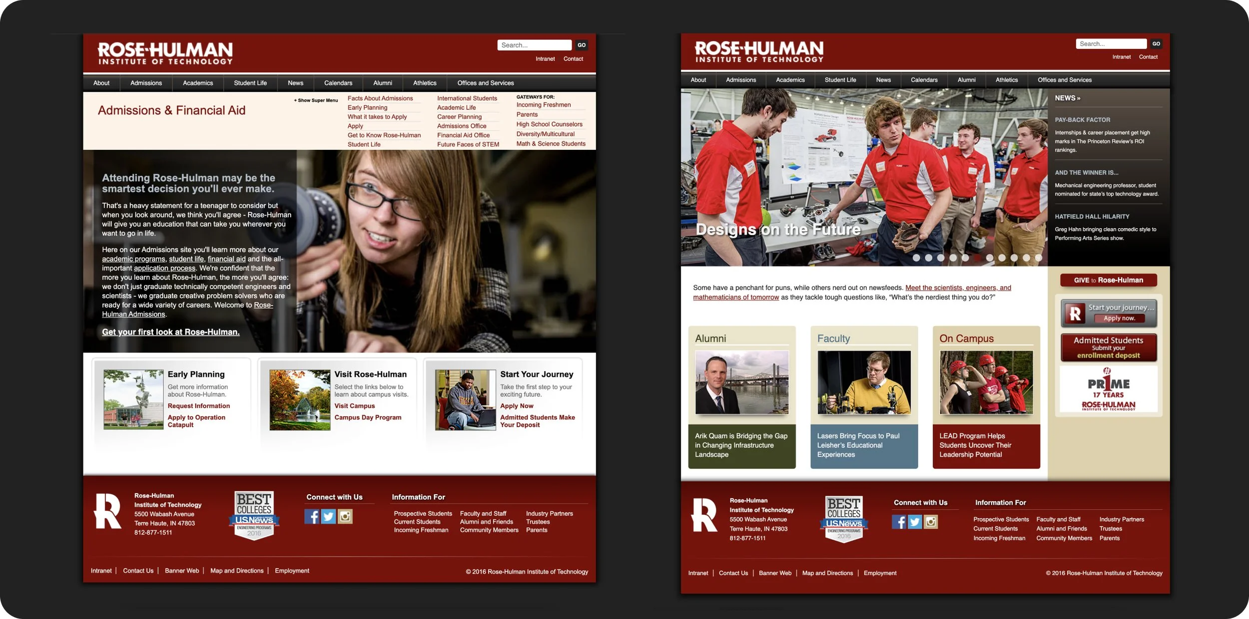
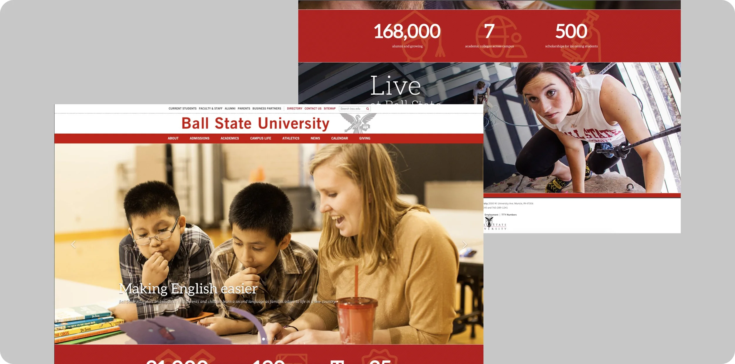
We explored regional private and public universities, private technical institutes and aspirational websites.
Trends:
lack of responsive design across competitors
specific routes / entry points for specific audiences (info for...)
emphasis on statistics
bloated (mega) navigation patterns
conservative use of color with an emphasis on neutrals


Competitive analysis: features
After we looked through the various websites for inspirations we began to categorize and compare various features to uncover trends and identify opportunities.
Opportunities:
Video / engaging media
Discoverability for specific audiences
Adding “quick links” or improve ease of access to important information
Leaning into responsive design
Storytelling and testimonials

Identifying user groups
In our competitive research, we discovered that our competitors identified and utilized “entry ways” for specific user groups.
In order to accomplish a similar approach to organizing our navigation patterns and “entry ways” we needed to identify our user groups and their needs.
The information we gain from user research will help us to improve ease of access to specific information important to those users.


Organizing tasks based from competitor research and small scale card sorting activities.
User research + testing
We began by testing the current website with potential students, we found through moderated testing, users had a neutral experience when searching and locating specific programs and applications on our website.
Potential students also had no way to easily compare programs and navigation proved to be difficult for them resulting in the user giving up locating follow up actions.
Especially frustrating when they could not locate the specific application they needed.

Example of an early journey map capturing potential touch points by (10) potential traditional students. Participants were sourced from usertesting.com.

We ran heat mapping to gain a better understanding of how our users interacted with areas of our site. By far users often were visiting our Academics site to learn more about our programs before making the step towards applying. We didn’t have clear next steps to guide users towards applying from our program pages.
Navigation + dashboard early conceptual wireframes
In order to strike a balance when supporting prospective and current students, we leaned into Academics being one of primary paths towards applying for new students and crafted content on the homepage for prospective traditional and international students.
The “dashboard” navigation supports current students, faculty and staff providing ease of access to specific areas of the site and resources.

We had explored a few directions while concepting, however this direction was the one that resonated in design. Each “tab” would contain resources, quick links and entry points for specific audiences.

Similar to how we had improved the ease of access for traditional prospective students, we leaned into a similar approach for quick links and resources for faculty and staff.

Early validation and results: Heat map analytics to track activity on the new navigation concept. Our early tests validated that specific user (audience) entry points reduced friction in users finding that they needed. We also moved Academics first in the navigation with ease of access to programs.
Design principles ✨
Simple
Avoid overloading users with a large number of links, pathways and call to actions in navigation patterns. A large amount of information and links for a number of audiences presents a risk of overwhelming users.
Visible + helpful
Primary navigation should be available at all times. Navigation patterns should feel like an invisible hand that guides the user.
Consistent
Navigation types must follow a consistent patterns throughout the site and each type serves a specific purpose within that site.
Accessible
In order to ensure a consistent experience and accessibility on mobile devices, we must be considerate of the minimum touch target size of 48px.
High fidelity designs 🎨
Final high fidelity design concepts of primary navigation.
Final high fidelity design concepts of primary navigation on mobile.
Final high fidelity design concepts for the dashboard. Student and Faculty/Staff dashboards with curated resources, quick links, support and tools.
🎉 Results
Homepage bounce rate improved going from 80% to 45% over the course of the following 4 months after the new navigation designs were implemented. Means users spent more time on the site before leaving (measured via Hotjar).
Our audiences self-identifying via entry points in navigation patterns and strategy reinforced marketing strategies by utilizing targeted analytics efforts.
Positive internal feedback from students, faculty and staff. The dashboard was by far the most impactful improvement.

We gathered feedback internal via surveys from various department / site owners and current students. Additionally we organized moderated user testing via usertesting.com.
Next project →
← Previous project